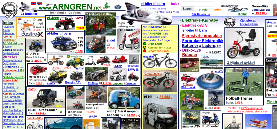
1. Focal point – this site has no real focal point due to the uneven pictures s well as the unusable interface as well as the bad typography it causes it to drastically lose the focus.
2. Rhythm – the rhythm of this website is very not really there because due to the scattered amount of information which messes with the flow of the site and causes it to lose its the understanding of the information.
3. Scale/ proportion – this site has no scale or proportion because the product pictures there are very scattered and are not set to a single size which gives off the the effect that some pictures are overlapping.
4. Balance – this site has no balance because it uses no grid which makes the products on the website very imbalanced and unorganized which is partly why this website has a very poor user interface.
5. Unity – This site has very poor unity because due to the randomness of the color arrangement and due to no grid or picture scale it causes the website to look like a collage of photos.
